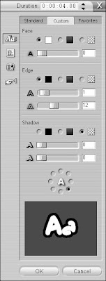
 To change the color of your text, click the Custom tab on the right side of the title editor screen. As you can see in Figure, this tab offers a variety of useful controls for text. The controls are divided into three sections: Face, Edge, and Shadow. Each section has a radio button for color, gradient, or transparent. If you want the element to be a solid color, choose the color radio button, and then click the color box next to it to open a color picker and choose a specific color. If you want the element to be a gradient (a color that gradually changes from one color at one side of the letter to a different color at the other side), click the gradient radio button and then click the gradient box next to it to specify the colors used in the gradient. If you want the element to be transparent, choose the transparent radio button.
The three sections of the Custom tab control separate elements of the title text:
- Face: This section controls the basic face of the text. You can choose a solid color, make the color a gradient, or make the text face transparent. Only choose the transparent radio button if the text has a thick, visible edge. You can also blur the appearance of the face using the slider control at the bottom of the Face section.
- Edge: Here you can change the color and size the edges of characters. Like the text face, edges can be a solid color, a gradient, or transparent. Choose the transparent option if you simply don’t want the text to have an edge at all. Adjust the upper slider in the Edge section to change the size of the edge. Move the slider right to make the edge thicker, or move it left to make the edge thinner. Remember, very thin lines will flicker when the movie is viewed on a TV screen, so try to make the edge at least three pixels thick. An indicator to the right of the size slider tells you the current thickness in pixels. To blur the appearance of the text’s edge, adjust the lower slider in the Edge section.
- Shadow: Add — and color — a shadow for your text, and control the direction of the shadow using the round direction control. Shadows can help make text easier to read over some backgrounds. Like other text elements, shadows can be a solid color, a gradient, or transparent.

No comments:
Post a Comment